Figma, Google Spreadsheets, Google Forms, discord, zoom, notion, Gemini
Prompt
Within 20 weeks our team had to create an application for Design @ UCI’s fall theme “Designing for the future”.
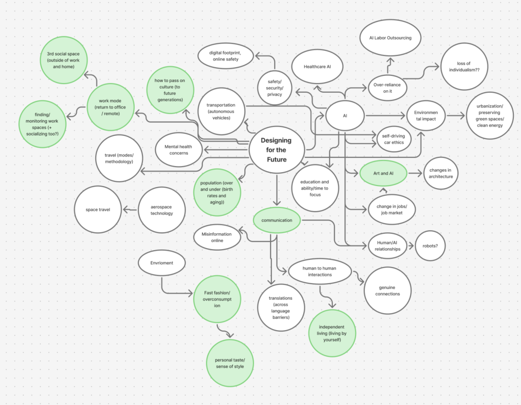
In groups of 6 our team had full creative control over the theme and each member interpreted the theme differently. Through figjam we laid our initial ideas of what the theme “Designing for the Future” meant to us.
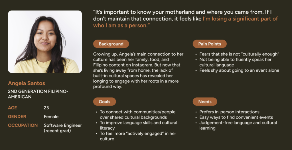
Many post-undergrad young adults (ages 20–30) who are x-generation immigrants or later feel disconnected from their roots outside of their families.
How can we create an inclusive and accessible platform that leverages community spaces and communication to foster a stronger cultural identity that can be passed on to later generations?
User Research
To better understand our target audience we did both qualitative and quantitative research on undergrad young adults. With over 45 respondents on an anonymous google form and 10 interviews we were able to identify pain points and better see user needs.
Goals
Connect communities with similar cultural background through social events. In which these social events are used as a space to improve language skills and cultural literacy.
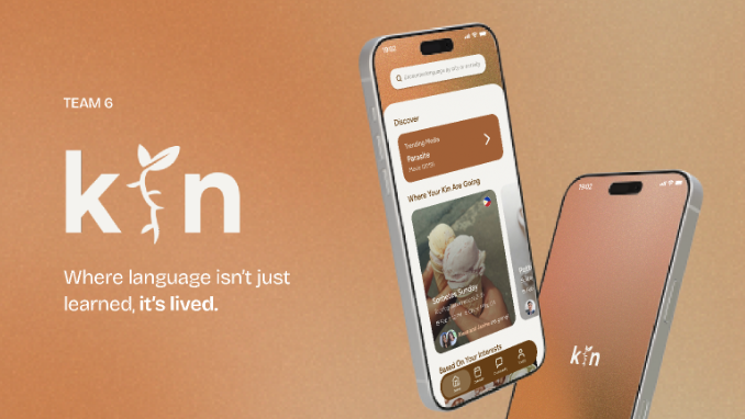
Learning a language is not only about memorizing words — it is about stepping into the people, culture, and environments where that language is alive.
Kin helps users do exactly that by connecting them to local encounters centered around conversation, shared interests, and cultural experiences, turning language learning into something social, immersive, and meaningful. Each feature, iteration, and frames aim to connect users through an immersive and stress-free experience.
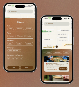
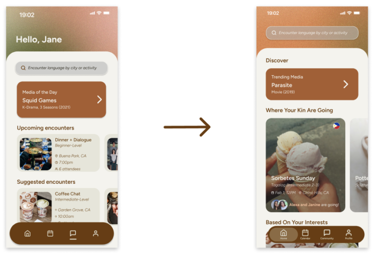
Kin makes discovery personal.
Search by city or activity.
Browse by language, level, time, distance, and group size.
See what matches your interests
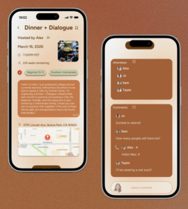
Kin helps people arrive prepared.
See who’s hosting.
Know the language level and seats left.
Check the location, directions, and event chat before you go.
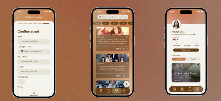
Kin turns encounters into ongoing connection.
From being able to host your own event, interacting with the community board, and being able to build your profile and adding friends overtime Kin knows community shouldn’t end after one event.
Usability Testing
Through conducting 4 usability testing Kin recieved great feedback in terms of branding and consistency. But faced critics in unclear icons and confusion of certain buttons.
Home Screen Confusion
Restructured the sections for clearer hierarchy and revised the section headers to better communicate their purpose and provide clearer cues for user action.
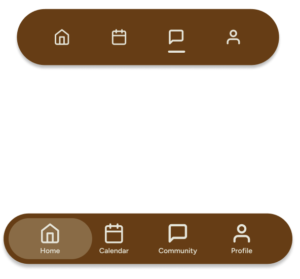
Nav Bar Confusion
Incorporated visual distinction for the status of the nav bar and added text to accompany icons to clearly communicate meaning.